How to Design your Wayfinding
- April 28, 2022
One of our clients recently implemented their own wayfinding signage, and they graciously put together the following “tutorial”, in their own words, to help other people who need to do the same.
General Advice
- Any signage should NOT block emergency exit signs.
- Stand in the space at various points and look around, see where the lines of sight are and those are likely the points where you might need a sign.
- Think about the target “audience”…
- lots of kids?
- lots of adults?
- lots of people who might be visually impaired?
- Think about if you had never been in the clinic, where would you automatically look for direction when…
- coming in the front door
- checking in
- looking for a washroom
- looking for specific drop-off spots
- looking for room numbers
- looking for the waiting room
- etc.
- Only put directional signs up where it is not obvious to outsiders where to go. Try and reduce the total amount of signage that you put up. Example: our waiting rooms are part of the check-in and reception area, so there are no signs that say “Waiting Room”. It’s obvious, there are multiple groups of chairs.
- Use the minimal number of signs necessary to direct. More is not better. Too much signage can cause confusion as much as too few signs.
- If hallways are part of the flow of the clinic for the patient, directional signs are needed there.
- Direct to other public washrooms from the obvious main washroom.
- Signage should be visible at multiple heights easily unless the signage will impede the flow of traffic. Example: ceiling sign hanging so low that someone will bang their head.
- Colours of signs should always stand out and be consistent.
- Sign colours should fit clinic colour scheme and aesthetic to reduce visual clutter. This helps with the overall clarity of wayfinding.
- Use universally recognised symbols / icons instead of text where possible. Example: instead of “washroom”, use a symbol to denote washroom.
- Use a combination of different signs (wall, floor, ceiling signs).
Checklist for Signage
Font / Typography
- Clean, clear, and easy to read font with numbers 1 and 7 being very distinctive from each other.
- Friendly looking (more rounded and less “lean”).
- Symbols like arrows or washroom should be clean, crisp, easy-to-understand.
- Fit the style of the clinic (i.e. clinics with a modern aesthetic will want crisp fonts and very simple images).
- Should support multiple languages… you might want to use different colours for each language and keep text to a minimum.
Colour Scheme
- The colour scheme of the signs should fit with the colour scheme of the clinic.
- Colour should be bright and should contrast with the colour of whatever surface that sign will be applied to (e.g. do not have blue signs if your walls are also blue).
- Colour of signs should “pop” strongly so that people gravitate to looking at it.
- Do not use red because of its association with emergency.
- Avoid using black as it’s boring and people might ignore it.
- If it looks good and is possible, the wall behind the sign can be painted a different colour from the rest of the walls to accentuate the signage even more.
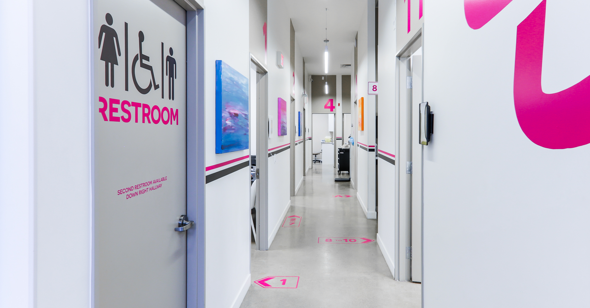
We chose magenta pink for the text of the signs because it fits our clinic’s brand: our clinic’s name is “Magenta Health” and our logo is a magenta pink flower. The general colour scheme of our clinic is white walls with grey doors, grey accent walls in rooms, and pink accent walls here and there. Because the majority of our indoor walls are white, bright, deep pink signage is easy to spot.
Another example of good wayfinding and signage is Bloorkids Pediatric Clinic. Their colour scheme consists of 2 kid friendly, cheerful, pastel colours of yellow and blue. They alternated the colours for each room which is nice. Magenta Health needs a more sophisticated look, so we decided to use the same colour on all room numbers and signs.
Types of Signs
- Vinyl stick-on cut-outs: many colour options, easy to install, almost any size, cheaper in general
- Raised lettering: very nice, pops out, easier to see, more expensive, maybe harder to install.
- On a board: more expensive, might not look as nice for room numbers, more labour intensive to create and install. Good for signs that hang from ceiling or stick out from wall.
Room Signs
- Size:
- You want to go big for room numbers
- Ideal room number is at least 19" high
- Adjust size depending on location constraints; the numbers here could only be as large as the location with the smallest panel allows.
- Placement
- Should be consistent so that patients know where to look at all times.
- If placing room signs on the wall, try to put them on the same side of the door (or above the door, depending on ceiling height and type of door).
- Placing room signs on the door itself is usually not good idea as they won’t be easily seen when the door is open.
- Alignment of signage in relation to the surrounding facility hardware or space is important for visual appeal. Eye-pleasing overall aesthetic makes wayfinding easier in general. Example: if placing room signs next to the door, then the top of the number should align with the top of the door OR the middle of the number should be aligned with the middle of the door.
Other Signage
- Size
- Signage should be as large as possible and still remain visually appealing.
- That being said, just because you can make it 45" high doesn’t mean you should.
- Placement
- Think about height of placement so everyone (tall, short, wheelchair user, kids) can see.
- Placement is especially important if sign needs to be smaller.
- Placement and type of sign depends a lot on the rest of the clinic space.
- Is the hallway wider than standard, the ceilings higher than standard?
- Will there be other equipment in the hallway that block floor signs?
- Will patients often bring things like strollers that block signage?
- If a sign sticks out into the hallway be mindful that people do not run into it
- Signage that stick out should not be anywhere between the floor and 195cm high
- Signage suspended from ceiling:
- If close to a wall and doesn’t interfere with hallway space can come down as low as needed
- Take care to make sure it’s not blocking emergency exit signs
- Should be large, but not too large to be unattractive and create a sense of visual clutter
- Should be high enough not to be knocked into
- Floor signs:
- Will be walked on a lot so use good quality vinyl
- No protrusions, needs to be flat so people don’t trip
- Should be large enough so that it will still be visible if any clinic or patient equipment is on top of it
Are there hallways?
- If there’s only one hallway with doors on one side then the solution is easy: just install room signs all the way down the hallway next to doors.
- If there is one hallway but doors on both sides of the hallway, think about flow of numbers:
- 1 to 10 looping around?
- Even numbers on one side and odd numbers on the other side?
- What makes sense visually and physically in the space? Example: if only 2 rooms out of 10 are on the right side then it would make more sense to number rooms 1-8 on left then 9, 10 on the right.
- If there are multiple hallways, you need to think about:
- Flow of the room numbers - what makes sense?
- How to direct people down the hallway?
- Do the hallways lead to separate waiting area(s) or just rooms? If yes, think about naming the areas.
- Should you name the hallways? Example: Hallway A, Hallway B or maybe Hallway North, Hallway South
- If naming the hallways, should you restart the room numbering? Example: Room A1, Room B1
- Think about have signage suspended from the ceiling directing people down the hallway and showing what room numbers are down that hallway. Be careful of size so it doesn’t block line of sight for emergency exit signs.
- Consider increasing the size if going with wall signage instead of signage suspended from ceiling as wall signage is easier to miss.
- Depending on ceiling height, consider floor signage.
- It might be necessary to have signage that directs people down another hallway. Example: second washroom down hallway to the right.
- Arrows should definitely be used to direct down hallways and minimal text if possible. Example: Rooms 9 to 10 →
- Multiple Hallways
- Placement should be at the hallway intersections, either on the floor or suspended from ceiling.
- Use arrows of some sort - either next to numbers or integrated into the sign
Other Room Types
- Are there rooms between exam rooms that are not exam rooms? Example: nurse rooms, washrooms, offices.
- Use a different approach to labeling these types of rooms to differentiate them from exam rooms. Example: If your exam rooms are numbered 1, 2, 3 then use A, B, C to name these types of rooms instead.
- If patients never need to access these rooms, might not need to number or letter or name, a simple “Staff Only” sign on door can be sufficient
Using Professionals to Design and Install
We used:
- Graphic designer: Branna Consulting
- We provided them with:
- Images of the space.
- Dimensions of the space, signs (numbers should be x cm high).
- Type of signs. (arrows? numbers?)
- Style of font - give some examples of what you like
- We provided them with:
- Printer / installer: Creative Silhouettes / Astley Gilbert
- We provide them with:
- PDFs from the graphic designer (should show dimensions of the sign)
- Location of the sign in the space - on the wall, on the door, hanging from ceiling
- Exact type of sign - vinyl sticker cutout, on a wooden board. etc.
- We provide them with: